

Contents
Seaborn Introduction
Learn about Seaborn
Import Library
Load Dataset
Distribution Diagrams:
Distribution Table
join Diagram
KDE Table
Pair Table
Categorical Plots:
Bar Chart
Counting Graph
Box Plot
Violin Plot
Bar Chart
Strip Plot
Styles and Palettes
Matrix Graph:
Heatmap
Cluster Graph
Pair Grid and Facet Grid
Regression Graph
Seaborn Introduction:
Certainly! Welcome to the world of Seaborn, your friendly guide to effortless data visualization! Unlike its counterpart, Matplotlib, Seaborn simplifies complex visualizations, allowing you to create beautiful and detailed charts with just a single line of code. Think of it as your intuitive artist, understanding your needs and crafting visuals effortlessly.
To get started, installing Seaborn is a breeze. In your Anaconda environment, open the terminal and type:
Copy codepip install seaborn
Now, let's embark on this exciting journey with Seaborn as your creative companion! Picture Seaborn as a skilled artist at your fingertips, transforming data into visually appealing graphics seamlessly. In this adventure, we'll explore Seaborn's world using its built-in datasets, delving into the magic of data visualization together!
Import Library:
import numpy as npy
import pandas as pds
import matplotlib.pyplot as pltlib
import seaborn as sn
Load Dataset:
To begin your data exploration journey, first, acquire essential datasets like "car_crashes" and "tips." Seaborn, with its user-friendly interface, simplifies this step, saving you valuable time and effort. By seamlessly integrating with libraries like NumPy and Pandas, Seaborn streamlines the entire process. This means you can direct your energy towards delving into the intricate details of your data, without the hassle of complex setup procedures. It's like having a trusted assistant that handles the groundwork, allowing you to focus on uncovering valuable insights within your datasets.
crash_df = sn.load_dataset('car_crashes')
tips_df = sn.load_dataset('tips')
crash_df.head()
tips_df.head()
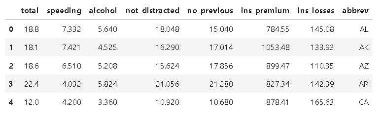
[Car_Crashes_Data]
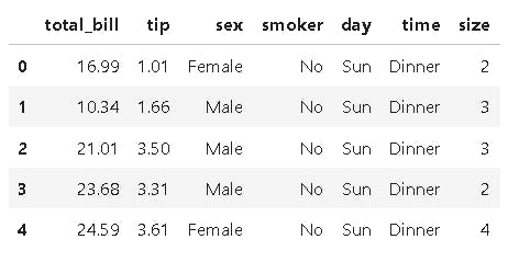
[Tips_Data]
Distribution Diagrams:
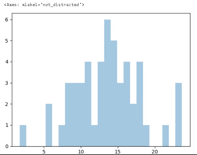
Distplot: Analyzing Univariate Distributions
The distplot method is your go-to tool for unraveling patterns and frequencies within a single variable, such as occurrences of distracted driving accidents. Think of it as a magnifying glass that zooms in on specific incidents, allowing you to understand their concentration within your dataset. By visualizing these patterns, you gain crucial insights that serve as a compass for guiding security measures. It's akin to shining a light on specific areas, helping you pinpoint where attention and preventive actions are most needed. This method equips you with a deeper understanding, enabling informed decision-making to enhance safety and security protocols effectively.
sn.distplot(crash_df['not_distracted'], kde=False, bins=25)
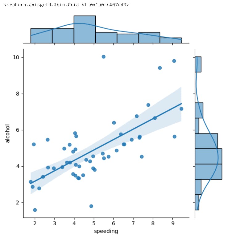
Jointplot: Comparing Distributions
The jointplot method is like a bridge that connects two variables, revealing intricate relationships between them. Imagine it as unraveling a compelling story; it helps you understand how these variables interact and influence each other. This method not only showcases correlations but also provides valuable insights that can be treasures for awareness campaigns. It's akin to finding hidden gems in a vast treasure trove of data, offering a wealth of knowledge that can be used to create impactful campaigns. By exploring these relationships, you gain a deeper understanding of the underlying dynamics, enabling you to craft campaigns that resonate effectively with your audience.
sn.jointplot(x='speeding', y='alcohol', data=crash_df, kind='reg')
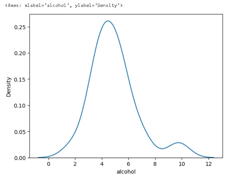
KDE Plot: Kernel Density Estimation
The kdeplot method is like an artist's brushstroke, delicately painting the nuanced details of a continuous variable's distribution. Instead of simply showing data points, it crafts a smooth, flowing curve that represents the probability density. Think of it as capturing the subtle shades of a landscape, where peaks and troughs reveal the varying likelihoods of different values. This method offers a deeper, more nuanced perspective on how the data is distributed, helping you grasp the underlying patterns and concentrations. It's akin to seeing the contours of a landscape, allowing you to understand the data's structure in a more intricate and refined manner.
sn.kdeplot(crash_df['alcohol'])
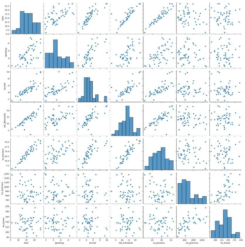
Pair Plots: Exploring Numerical Relationships
Pair graphs are like intricate maps that showcase the connections between multiple variables. Imagine you're examining a complex network, where each node represents a different aspect of your data. Pair graphs meticulously chart out these relationships, providing a comprehensive view that goes beyond individual connections. It's as if you're stepping back to see the entire forest instead of focusing on individual trees.
In the business world, understanding these interconnections is invaluable. It's like seeing how different departments in a company collaborate – marketing influencing sales, sales impacting production, and so on. By grasping these holistic patterns, you're better equipped to develop strategies that address various aspects simultaneously. These graphs serve as your compass, guiding you towards well-informed decisions that consider the bigger picture. It's like having a panoramic view, allowing you to navigate the complexities of your data landscape with clarity and precision.
sn.pairplot(crash_df)
Categorical Plots:
Bar Plots: Aggregating Categorical Data
Bar plots act as visual summaries, aggregating categorical data into easily digestible insights. Picture it as a bar graph representing different categories, like gender groups in a restaurant dataset. The length of each bar signifies the median spending patterns for a specific gender. It's like distilling a wealth of information into a simple, understandable form.
For instance, in a restaurant setting, bar plots can show the median spending of males and females. These plots are essential tools for understanding customer behavior, allowing businesses to tailor their services effectively. It's akin to a snapshot, capturing the essence of spending habits among different gender groups, guiding businesses in their decision-making process. By presenting data in this way, bar plots offer a clear and actionable glimpse into customer demographics, helping businesses align their strategies with customer preferences.
sn.barplot(x='sex', y='total_bill', data=tips_df, estimator=npy.median)
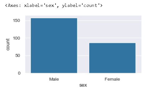
Count Plot: Counting Occurrences
Count plots serve as straightforward visual aids, offering a clear depiction of customer distribution based on gender. Imagine it as a tally sheet, counting the number of occurrences of each gender category. This simple yet effective representation provides businesses with a quick snapshot of their customer demographics.
In practical terms, consider a restaurant using count plots to understand the gender distribution of its patrons. By visualizing the number of male and female customers, the restaurant gains valuable insights into its clientele. This information is invaluable for tailoring services to meet specific customer needs. For instance, it might influence menu choices, promotional offers, or even the restaurant's ambiance.
Count plots, in essence, provide businesses with a practical tool to align their services with customer demographics accurately. By having a visual representation of customer distribution, businesses can make informed decisions, ensuring their offerings are precisely tailored to their diverse customer base. It's like having a clear map, guiding businesses to create an inclusive and customer-focused environment.
pltlib.figure(figsize=(4,2))
sn.set_context('paper', font_scale=1)
sn.countplot(x='sex', data=tips_df)
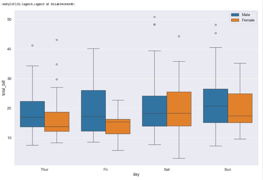
Box Plot: Comparing Variables
Box plots are like detailed maps, offering valuable insights into the variations of total bills across different days and gender groups. Think of them as windows into customer spending behaviors. These plots not only show the overall distribution of spending but also break it down by specific days and gender categories.
For instance, in a restaurant scenario, box plots can reveal not just the average spending but also the range and outliers for different days of the week, highlighting the days when customers tend to spend more or less. Moreover, when considering gender, businesses can identify distinct patterns in spending habits. It's akin to decoding a puzzle – understanding why spending patterns fluctuate on certain days and how gender influences these variations.
This detailed information empowers businesses to make strategic decisions. For example, a restaurant might use this data to offer targeted promotions on days when spending is historically lower, enticing more customers. Similarly, understanding gender-specific spending patterns allows businesses to tailor marketing strategies to different customer segments effectively.
In essence, box plots serve as a lens, enabling businesses to zoom in on specific days and customer groups, deciphering the nuances of spending behaviors. Armed with this knowledge, businesses can optimize their offerings, enhance customer experiences, and make data-driven decisions that positively impact their bottom line.
sn.boxplot(x='day', y='total_bill', data=tips_df, hue='sex')
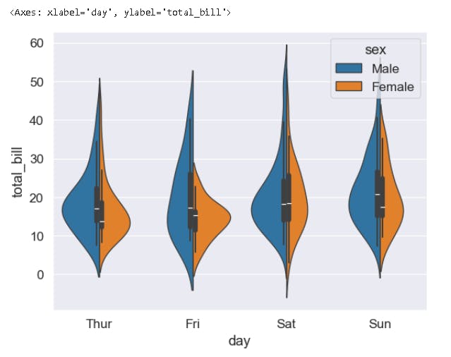
Violin Plot: Combining Box Plot and KDE
Violin plots are like masterpieces in the world of data visualization. They offer a holistic view of the data, bringing together essential summary statistics and the underlying probability density. Imagine it as a multifaceted prism, refracting light in various directions to reveal intricate patterns within complex data structures.
To understand this, consider a dataset with multiple variables. Violin plots provide a detailed representation of the distribution of these variables. The width of the plot at different points indicates the density of data, resembling the curves of a violin. The wider sections represent areas where data points are densely packed, while narrower parts signify sparser regions.
This unique combination of summary statistics, such as median and quartiles, along with the intricate details of data density, makes violin plots perfect for comparing diverse datasets. It's like having a magnifying glass that not only shows you the big picture but also zooms in on the subtle nuances. By visualizing data in this comprehensive manner, researchers and analysts can grasp the complexity of their datasets.
In essence, violin plots are sophisticated storytellers, painting a vivid picture of the underlying data distribution. They're invaluable tools for researchers and data scientists, providing deeper insights into the variations within complex datasets. Just as an artist combines different brushstrokes to create a masterpiece, violin plots harmonize various data elements into a visually compelling narrative.
sn.violinplot(x='day', y='total_bill', data=tips_df, hue='sex', split=True)
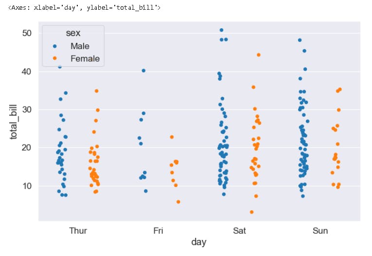
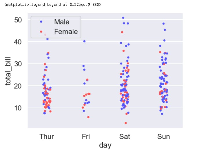
Strip Plot: Visualizing Individual Data Points
Strip plots offer a close-up view of individual data points, allowing businesses to understand specific customer preferences. They're like detailed snapshots, revealing unique spending habits and behaviors. This insight empowers businesses to personalize strategies effectively, enhancing customer satisfaction and loyalty.
sn.stripplot(x='day', y='total_bill', data=tips_df, jitter=True, hue='sex', dodge=True)
Styling and Palettes:
Choosing the right style and color palette is like adding a touch of magic to your visuals. By customizing these elements, you not only enhance the aesthetics but also ensure that your message is clear and visually appealing. This attention to detail is crucial for effective communication, especially when you're creating presentations, reports, or making important decisions based on data. Think of it as painting a vivid picture with your data, making it engaging and easy to understand for your audience. So, don't underestimate the power of thoughtful styling and palettes—they transform data into compelling stories!
sn.set_style('darkgrid')
sn.set_context('talk')
sn.stripplot(x='day', y='total_bill', data=tips_df, hue='sex', palette='seismic')
pltlib.legend(loc=0)
Matrix Plots:
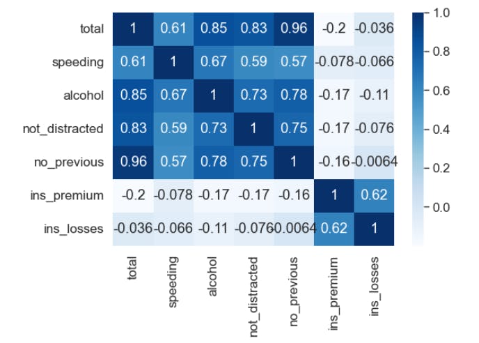
Heatmap: Visualizing Correlations
Imagine a heatmap as a color-coded map of relationships within your data. In this visual representation, darker colors signify stronger connections between variables. This simple yet powerful tool aids decision-makers by highlighting influential factors. It's like having a spotlight on the most important aspects of your data, allowing for quick insights into complex relationships. In the world of data-driven decision-making, heatmaps are invaluable—they transform intricate data patterns into clear, actionable knowledge.
crash_mx = crash_df.corr()
sn.heatmap(crash_mx, annot=True, cmap='Blues')
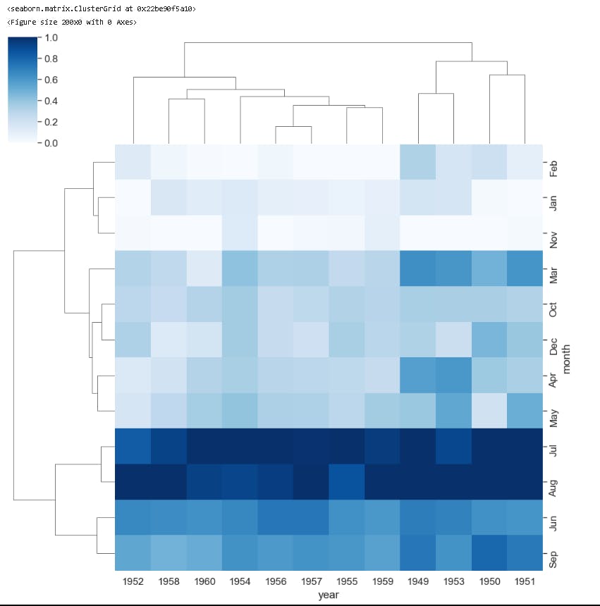
Cluster Graph: Hierarchically Clustered Heatmap
Cluster heatmaps act like detectives, grouping similar variables to unveil hidden patterns. By rearranging data based on similarities, they reveal subtle relationships and intricate structures that might go unnoticed. This deep dive into data nuances offers valuable insights, helping you develop targeted strategies for complex datasets.
flights_data = sn.load_dataset("flights").pivot_table(index="month", columns="year", values="passengers")
sn.clustermap(flights_data, cmap="Blues", standard_scale=1)
Pair Grid and Facet Grid:
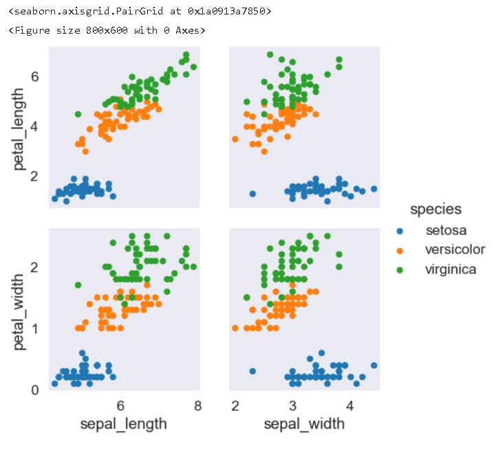
Pair Grid: Grid Systems of Plots
A pair grid creates a scatterplot matrix that describes relationships between multiple variables. By studying patterns and clusters, researchers gain insights. This is important for understanding the interaction of variables and performing detailed analyses. This makes these graphs a powerful tool for understanding data.
iris_g = sn.PairGrid(iris, hue="species", x_vars=["sepal_length", "sepal_width"], y_vars=["petal_length", "petal_width"])
iris_g.map(pltlib.scatter)
iris_g.add_legend()
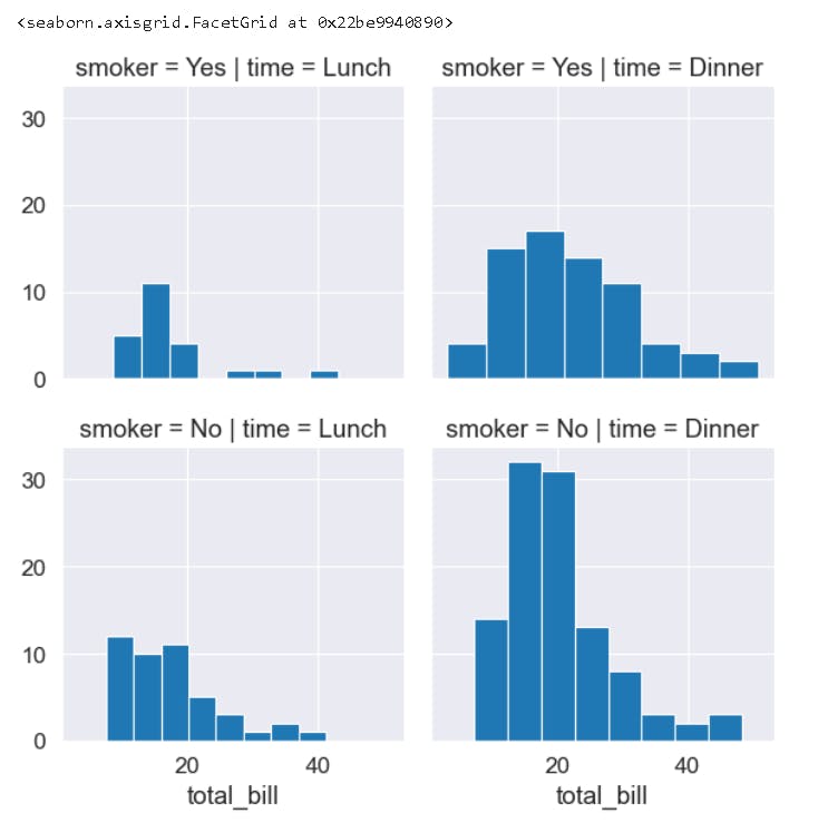
Facet Grid: Multiple Plots in a Grid
Generate multiple histograms for smokers and non-smokers based on total bill amounts:
tips_fg = sn.FacetGrid(tips_df, col='time', row='smoker')
tips_fg.map(pltlib.hist, "total_bill", bins=8)
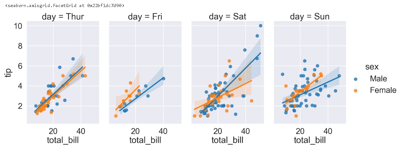
Regression Plot:
lmplot: Regression Plots with Facet Grid
Explore how gender and day influence regression plots investigating the relationship between total charges and tips:
sn.lmplot(x='total_bill', y='tip', data=tips_df, col='day', hue='sex', height=8, aspect=0.6)
Conclusion:
Seaborn is like a talented artist that works with Python. It takes the complexity out of creating beautiful and meaningful graphs by providing a simple way to visualize data. Building on the strong foundation of Matplotlib, Seaborn offers a wide array of stylish colors and themes that instantly enhance the visual appeal of your graphs. Whether you're a beginner or an experienced data professional Seaborn is crafted to simplify and enhance the creation of graphics. It's akin, to having a companion who ensures that your data communicates its narrative in the captivating manner conceivable.